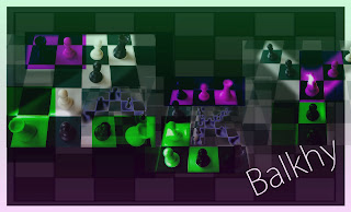
In this version of my photo letters portrait, I decided to make the letters hard to read. I added my last name and made it very clear in order to draw the eye to it. I added colored squares in purple and green in order to make the letters seem eerie and I made the letters different sizes to make it seem more crazy and unorganized. I think I portrayed my idea well and topped it off with a purple gradient going up and a green gradient going down.
No comments:
Post a Comment