Saturday, March 31, 2012

Surreal Research Photo


I think that this photo is successful, because it has good unity, and the idea of a field and book really show the same mood of peace. It is also very visually striking. In my surreal image, I would like to emulate the technique of imposing a picture on a book. I think it will really help get my idea across.
Thursday, March 8, 2012

Photo Letters Version 2


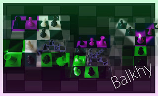
In this version of my photo letters portrait, I decided to make the letters hard to read. I added my last name and made it very clear in order to draw the eye to it. I added colored squares in purple and green in order to make the letters seem eerie and I made the letters different sizes to make it seem more crazy and unorganized. I think I portrayed my idea well and topped it off with a purple gradient going up and a green gradient going down.

Friday, March 2, 2012

Photo Letters Project Version 1


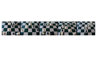
I used chess pieces for this project because chess is something that I am interested in. I think that I did a good job with unity by using the same pieces for each letter. I also applied the same effect to each picture around the pieces to make the letters stand out. I took all these pictures at the same time of the day to promote unity as well. Instead of putting separate borders on each picture, I used black space in-between each, and aligned them so that it flowed better. I believe I did a good job with actually taking the pictures, and was careful to avoid “noise” and make them focused.